
www.Bralla.net

377 Farmview Drive
East Earl, PA 17519
610-810-7716
Exquisitely simple
Maddeningly complex
Essential for Survival!
|
|
J. R. Casey Bralla www.Bralla.net 377 Farmview Drive East Earl, PA 17519 610-810-7716 |
"Lean Manufacturing" Exquisitely simple Maddeningly complex Essential for Survival! |
Get Help
Lean Topics
Vocabulary
Reading
Site Hosted by
Vorlon Information Technologies

Entire site Copyright © 2012 by J. R. Casey Bralla
(except for obvious external works).
All rights reserved.
NOTE: If you link to this site, or otherwise find it useful, please send a brief note to the author. Thank you!
We measure all kinds of things in our daily life. We use our speedometer to make sure we don't drive too fast on the highway. We measure the air temperature with a thermometer to know whether we should wear a jacket outside. If we want to improve something in our lives, like losing weight, we carefully weigh ourselves every week, or analyze our bowling scores to see if the that new bowling ball helped like we had hoped.
One of the great truths to life is that we will tend to improve anything that we measure. We track our factory's labor utilization in order to squeeze every drop of efficiency we can get from our associates. We measure our scrap rates to ensure our corrective actions are actually reducing them.
If we are really smart, we let everybody know how we're doing on scrap rates and labor efficiency. We want allies in our fight to improve, and sharing that information helps enlist these allies on the shop floor.
A visual metric is, at its most basic, simply a measurement that we make public. However, in order to be effective, it needs the following attributes:
Similarly, there are some rules about what not to do:
When we update visual metrics, we like to update them by hand by the person doing the work. We want to create an emotional sense of ownership with the person doing the work. The act of writing down a metric (especially if it is below target) will enhance this sense of ownership and responsibility. On the other hand, if they simply take a computer printout and post it on the bulletin board, that emotional sense of responsibility is greatly diminished.
This is why we say that metrics should be simple enough to gather with nothing more complex than a clipboard and a calculator.
The second most important part of visual metrics is the reaction they generate in management. Management has to be seen as actively reacting to both positive and negative results on the metric. Ideally, these responses are generally positive, even when the data is poor. We encourage managers to find the root cause of the problem and correct it, rather than shooting the messenger. Most importantly, we want managers to praise accomplishments.
If management is seen to be ignoring these metrics, they actually have a negative impact on performance. If the boss doesn't seem to care how the facility is performing, why should any one associate care? Be sure you are seen publicly reviewing and reacting to the data on the metric boards.
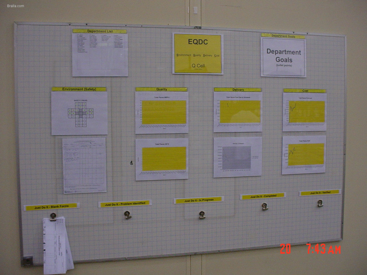 |
"EQDC" board.
A good overall metric which lists details about "Environment" (safety and environmental hazards), "Quality", "Delivery", and "Cost" (or sometimes "Productivity"). These 4 items form the basis for an overall metric for the performance of a department or complete factory. This one looks very nice and professional, but I would have preferred if the data was entered by hand by the production associates. That would help reinforce an emotional feeling of ownership for the performance of the team. |
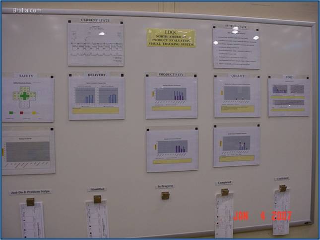 |
"EQDC" board.
Another example of an EQDC board. Again, this is very professional looking, but I would prefer hand-entered data from the person actually doing the work. |
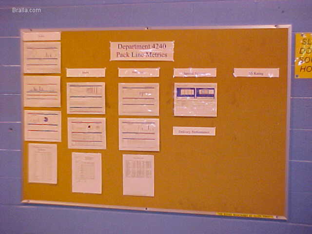 |
Cell Metric board.
A simple board for a production department. |
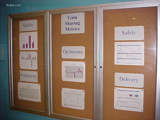 |
Cell Metric board.
A simple board for a production department. This one lists profit sharing information for the production associates. |
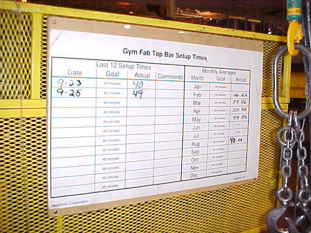 |
Changeover Time board.
Another example of how changeover time is publicly tracked. This one is mounted on a particular machine that took a long time to change over. |
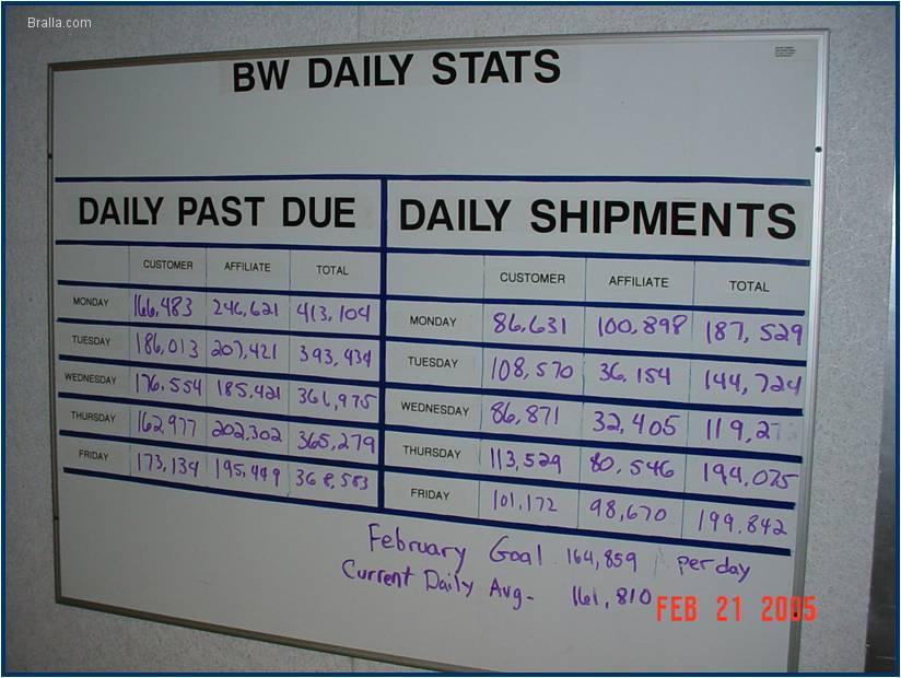 |
Daily Shipments board.
This facility had a problem with a large backlog of unfilled orders. (What a nice problem to have!) This board was placed along a central hallway that almost every associate passed several times per day. The data lists the daily production by product category, and the total backlog of that category. ("Customer" refers to external customers, while "Affiliate" refers to products ordered by sister plants in other divisions of the same company.) |
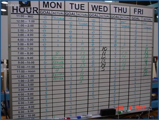 |
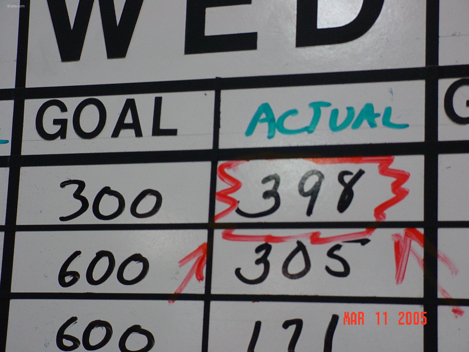
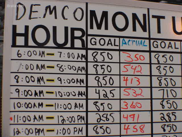
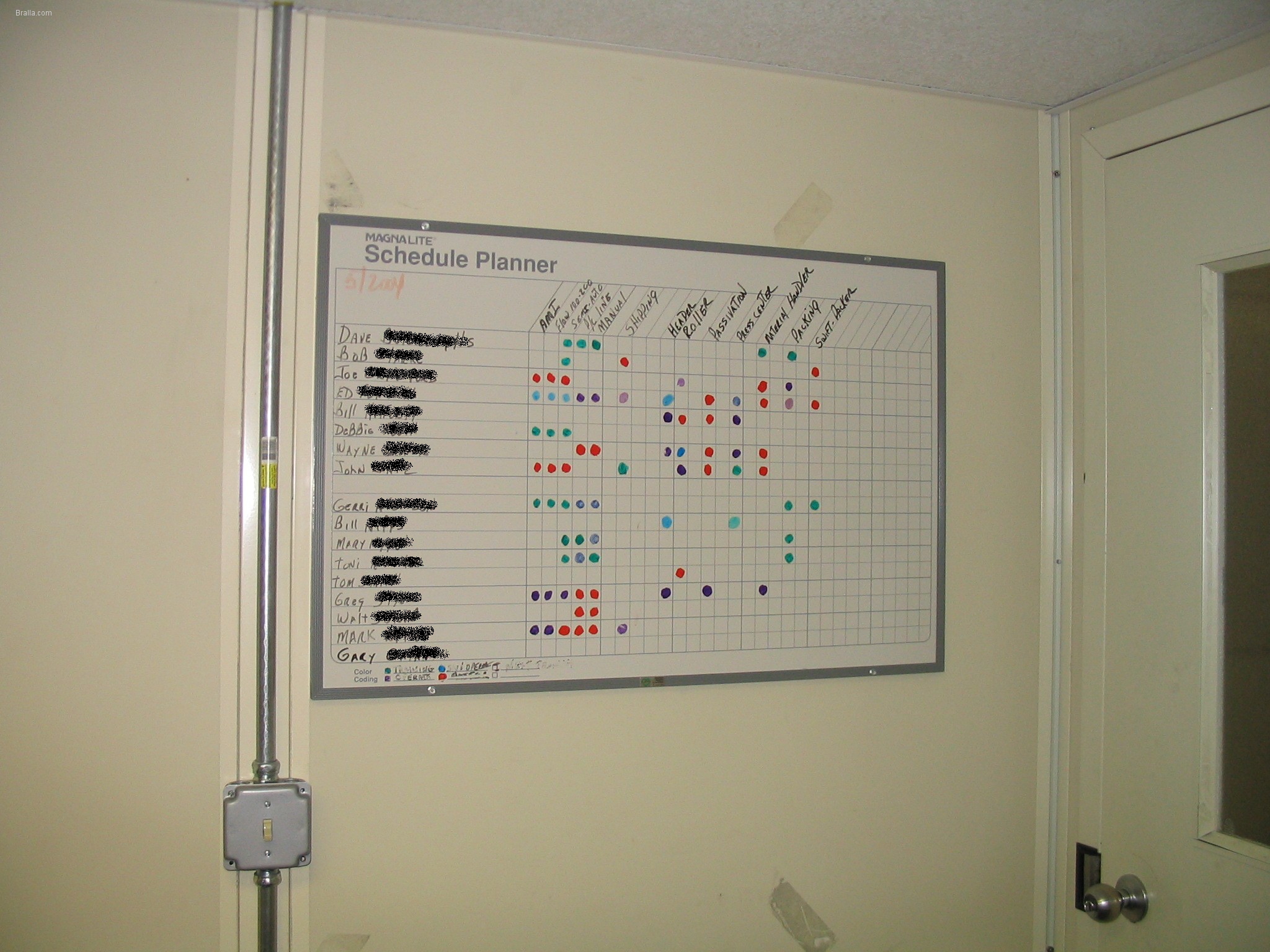
Day-by-the-Hour board.
This is one of the most powerful (and underutilized!) visual metrics available. It sets very clear expectations, enhances the emotional attachment and ownership of responsibility for production, and allows managers to quickly identify (and potentially correct) problems in production. Organizations that fully embrace this tool find it invaluable. |
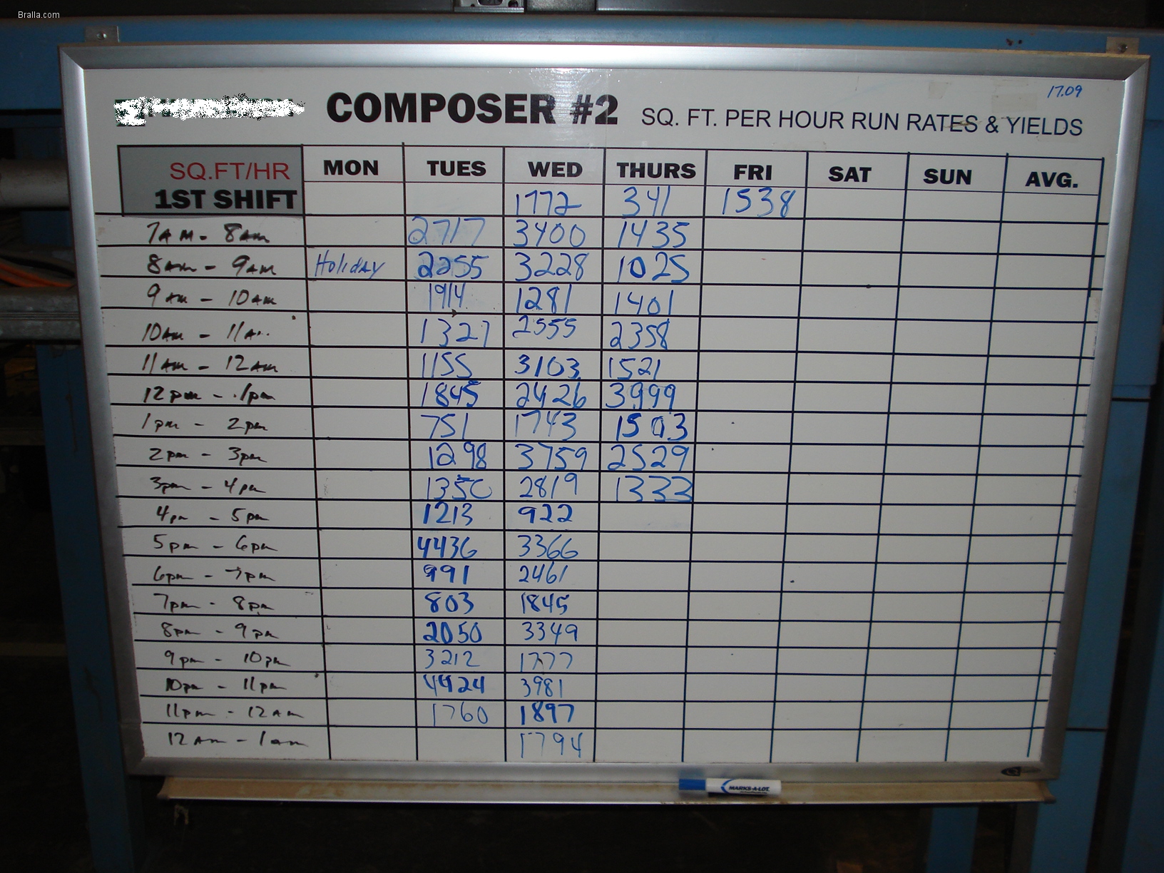 |
Day-by-the-Hour board.
Another example of my favorite visual metric. |
 |
Day-by-the-Hour board detail.
We prefer to react in a public, positive way to good news, and privately to bad news. Here's how I recommend good news gets recognized on a Day-by-the-Hour board. This lets the associates know that management has reviewed the board, and is appreciative of the hard work it takes to hit our goals. Managers confer privately with the associates who did not make goal, and try to find (and correct) the problems which interfere with hitting the goal. These corrective actions may be disciplinary action, but are more likely to be technical fixes. By attacking the technical problems, I find that people tend to rise to the challenge and ensure they work hard enough to hit the goal. |
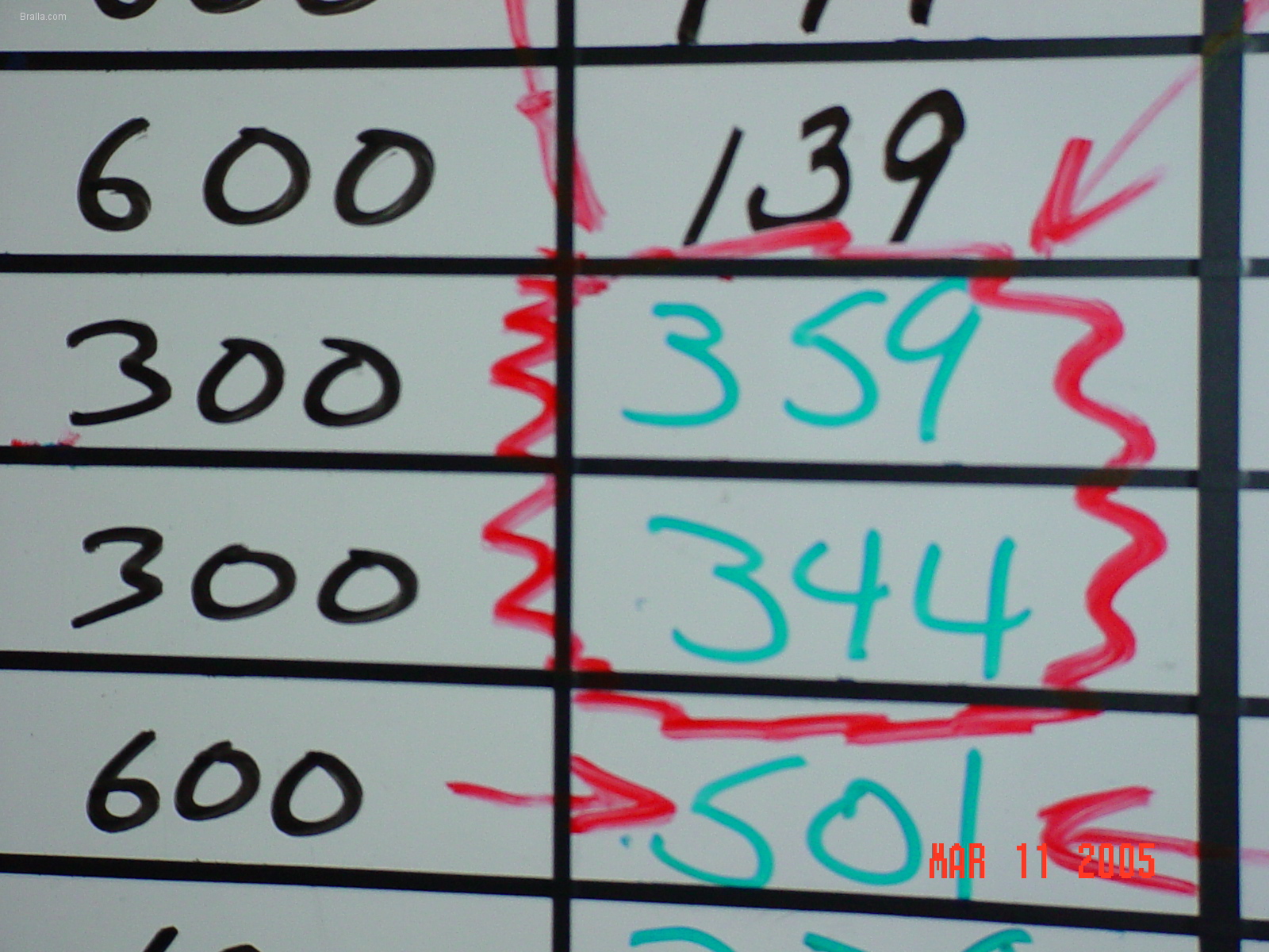 |
Day-by-the-Hour board detail.
Another example of how management responds to good or bad news. Also notice how the goal is not the same for every hour. We reduce the goal based on actual working time. In this case, the associate is expected to be on lunch break, so will not make a full hour's production, and so the goal has been appropriately reduced. |
 |
Day-by-the-Hour board detail.
This one isn't as pretty as the others, but who cares? The important thing is that we measure and respond to the data. |
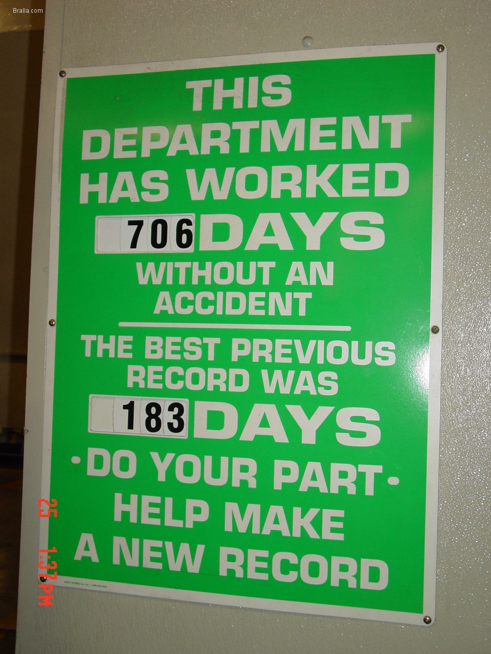 |
Safe Working Days board.
This type of board is pretty common in factories. I'd prefer to have someone manually write the number of days since an accident, but this is also a good way of showing it. Beware, that you will often see this type of board that has obviously not been updated in a very long time. It should go without saying that neglecting to update a Visual Metric is one of the worst management sins that can be committed. If management doesn't care enough about Safety to update the sign, they obviously don't care much about safety at all. |
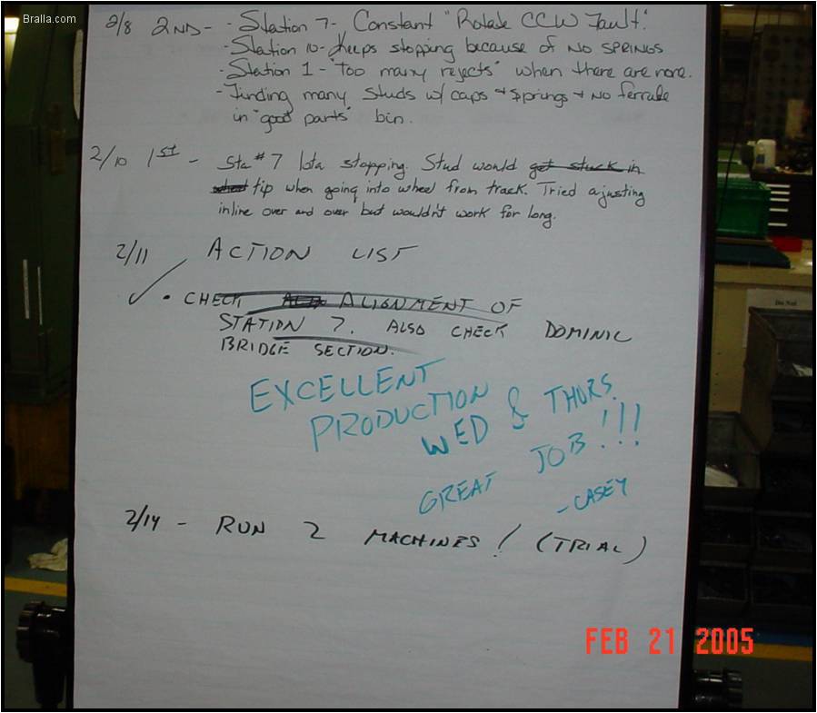 |
Flipchart.
Not all visual metrics are formal, printed signs and boards. Often, a flipchart is all that is needed to convey information. In this case, a particular machine needed attention and a team of operators and engineers was attacking a problem. We don't like to make improvements in secret; we want everybody to know what we are doing. A simple flipchart allowed for good, simple, public communication among the team members, and allowed everybody else to know what was going on. |
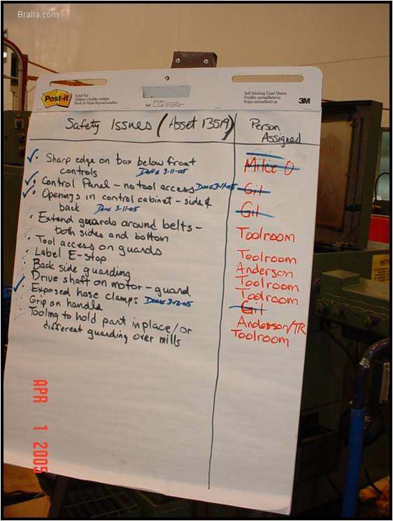 |
Flipchart.
Another example of how a flipchart was used as a metric and communication tool. In this case, it was used to track action items to correct safety problems with a piece of equipment. |
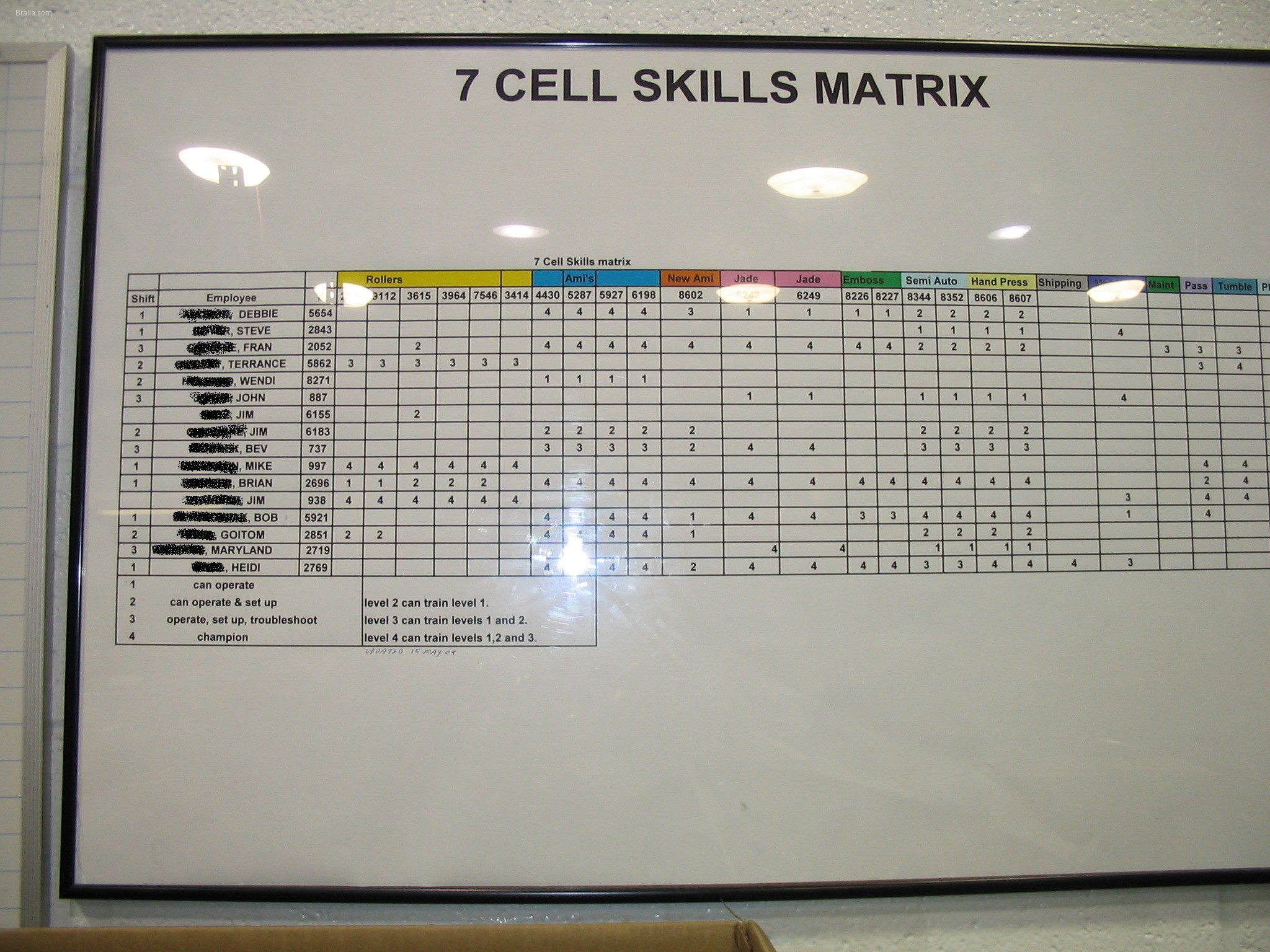 |
Skills Matrix.
Another very powerful, and underutilized visual metric. You just had one of your crew call in sick. Who will run that machine today? Who is capable? Long-time supervisors feel this tool is unnecessary, since they already know who can do what jobs. Why keep that info in your head, when we can have a system that does it for you? And why not let everybody know who can do various jobs? Won't this encourage less-well trained associates to become capable of doing those jobs too? |
 |
Skills Matrix.
Another example of a skills matrix. |
.jpg) |
Skills Matrix for Engineers.
This system works for engineering jobs too. I once had to manage an engineering department where I was not an expert at the processes being used. I let the engineers tell me what their capabilities were, then knew immediately who I could assign to a project. |
 (Detail).jpg) |
Skills Matrix for Engineers.
A close up of the chart above. The engineers rated their skills for me in things like CAD drawing and the various processes used. "E" meant "Expert"; "A" meant they were knowledgeable, but probably couldn't teach it to someone else; "C" meant they knew it, but not very well; "T" meant they were in training for that skill. |